[x]

deviantART


©2006-2009 *dashinvaine
Details
Submitted: December 22, 2006
File Size: 106 KB
Image Size: 63.4 KB
Resolution: 600×423
Comments: 18
Favourites & Collections: 53 [who?]

Views
Total: 1,473
Today: 0

Downloads
Total: 152
Today: 0

Embed


Thumb

Artist's Comments

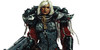
The final composition, after much fiddling around. Combines two old pieces. Drawings scanned, and coloured in photoshop, sans mouse.
[x]

Devious Comments

love 0 0 joy 0 0 wow 0 0 mad 0 0 sad 0 0 fear 0 0 neutral 0 0

Comments


Magnificent.

--
"Verum, sine mendacio, certum et verissimum: Quod est inferius est sicut quod est superius, et quod est superius est sicut quod est inferius, ad perpetranda miracula rei unius." (Emerald Tablet, 1541)
Very smoothly done!
The issue with balance here is that they're both in one of the 'thirds' of the picture. In film, we call this the "rule of thirds" ([link]) wherein you have a picture sectioned into thirds, vertically and horizontally. The dominant points are where the vertical and horizontal lines intersect. Joan is at one (though she's been given a bit too much head room) and the knight is at the other. It confuses the viewer, and you wonder if the knight is coming after Joan? Maybe make him a bit smaller, give him less headroom. You could also work with throwing some of the background and the knight out of focus, which will give the illusion of depth (example: [link] ) I like gaussian blur for that.

--
sweeney todd online

Face it, Harl, this stinks. You're a certified nutso wanted in two dozen states, and hopelessly in love with a psychopathic clown.
Sorry, just seen the above comment and I will try to behave with dignity. Before photography was invented, and before internet pages started passing themselves off as points of information, artists had long celebrated the Golden Section and your composition observes this. In fact, I think it's even more pleasing because of the way the towers and sword break into the upper section of the composition and alleviate the predictability of dividing the work into thirds.

I'm impressed by the way you've developed this and finished it so swiftly. A wonderful piece.

--
Jigsaw Puzzle Project
Originally there was even more to it on the knight's side, but it seemed to be pushing Joan off the other way too much, and if I kept on adding bits it would end up as long as the Bayeux tapestry. I take your points, and if I hadn't daftly flattened the layers at a certain point I probably would move the knight into the background more. However it's not absolutely a rule that having a character half cut off equals bad composition. Degas and Toulouse-Lautrec did it all the time. Also I gave Joan more head room becaue I wanted the top of the tower in, and I didn't want to move the tower down because that would make the character look like a giant. A WIP of this was crigicized on conceptart.org because she had too little headroom. There's no pleasing everyone. I still see things I don't like in this. Maybe I will have another fiddle with it.
You finished it perfectly!

--
"You must do everything yourself." (First rule of Alchemy)
amazing work

--
I'm proud of this
"If there is a will, there is a way"
Many thanks. Anything rather than get on with some uni work!

Site Map